
A calm PDP framework for clear images, useful details, and confident buying decisions.

How to organize a compact home collection so it still feels complete and browsable.

Why care notes reduce hesitation and make product ownership feel easier.

How to refresh apparel stories without turning the catalog into trend noise.

How to connect clean product photos with real context on editorial pages.

How clear measurement copy lowers returns across apparel, furniture, and accessories.

A concise FAQ framework for shipping, returns, care, fit, and product ownership.
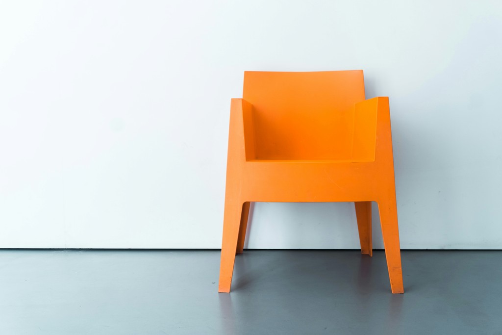
Furniture and habits that keep posture, focus, and energy balanced.
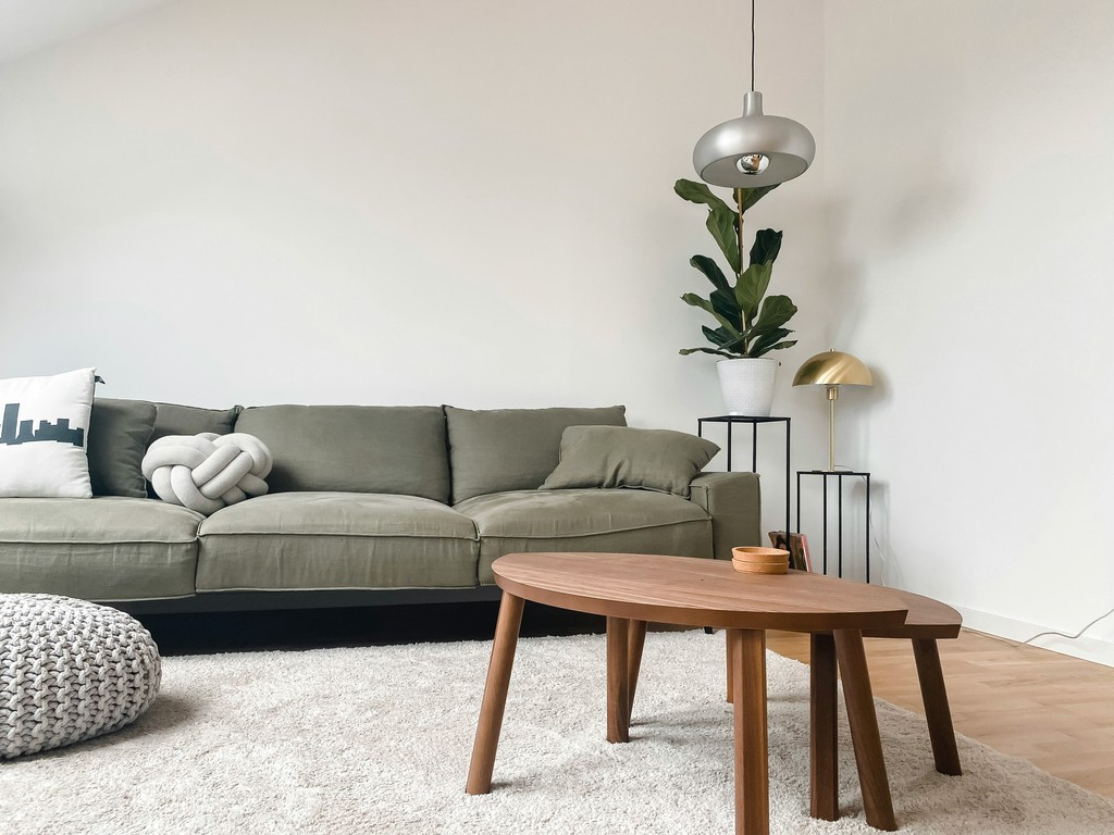
Build once, reconfigure often—systems that adapt as life changes.

Design less, wear longer—clarity over churn

How editorial guidance can turn a wide catalog into a simpler path to the right product.

A simple shot system for consistent thumbnails, quieter browsing, and stronger detail pages.

A merchandising approach for pairing products by routine, room, or outfit.

A clear way to explain cotton, linen, wood, metal, and recycled materials without jargon.

A practical taxonomy guide for tags that help customers browse instead of cluttering the CMS.

A template-friendly approach to responsible language that stays specific and editable.

How useful articles can connect naturally to products without becoming aggressive sales pages.

Design for the hand—texture, weight, and edges signal value.

How limitations unlock creativity, clarity, and better products

How ethical sourcing, durability, and transparency pay back the business

A practical way to use neutrals, contrast, and small accents across a product-first store.

The quiet details that make browsing categories feel curated rather than generic.

Small content and interface choices that make the final step feel predictable.

Why quiet spacing can make product cards, filters, and detail pages feel more valuable.

How restraint, materials, and proportion can make simple products feel considered.
How to make collection sections feel like a curated store, not a list of modules.

Small drops, tight stories—learn faster, waste less, sell through.
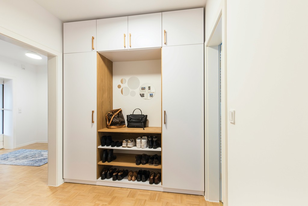
Turn off-cuts into limited runs with traceable, profitable stories.
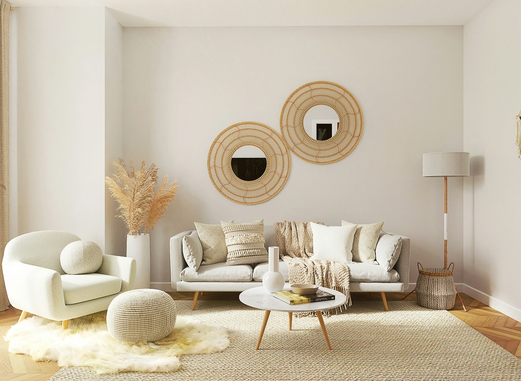
Space‑smart principles, modular layouts, and materials that work hard
From commute to trail—modular layouts without compromise